12 iPhone features that are now part of Android
Apple has more to answer for than you might think
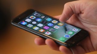
“Look at those smug iPhone owners, don’t they realize Androids had that feature ages ago?”
We’ve listened to people saying that almost since Android arrived in 2008. But the real relationship between Android and iOS isn’t a sprint to some imaginary finish line. It’s a dance.
For every feature Apple quietly pilfered from Android or another piece of older tech, only to claim it’s a revolution, there’s either a tech experiment it has made mainstream or a genuine innovation Android heads are loath to give Apple credit for.
These are the 12 features we can thank, or blame, Apple for in our Android phones.

1. Dual app multi-tasking
Year: 2015
Samsung experimented with letting you run two apps on-screen at once in phones almost half a decade ago. The feature was called Multi Window.
However we could argue Apple adding it to the tablet version of iOS in 2015 was what finally made Google add it to the official feature list of Android. It first appeared in a developer preview of Android 6.0, before going ‘public’ with Android 7.0 Nougat.
You can picture Samsung UI designers letting out a sarcastic “thanks, Google” at their timing.
Do we use it in our Android phones? Not much, if we’re honest. However, it can be handy for tablets.

2. Multi-touch pinch zooming
Year: 2007
One of the big features Steve Jobs talked about in 2007 at the launch of the first iPhone was something that seems almost comically simple: pinch zooming.
It became a representation of the intuitiveness of iOS and a cornerstone of the drastically overused “it just works” line we heard from far too many iPhone owners between 2007 and about 2013. They were long years.
Some of the first Android phones, including the HTC Dream (G1), didn’t have multi-touch tech at all.
However, Google added support for multi-touch to the roots of Android with Gingerbread. As is so often the case with Android devices, though, manufacturers added support for multi-touch zooming long before this. Back in 2009 HTC added it to the HTC Hero, for example.

3. Capacitive touchscreens
Year: 2007
The original iPhone was not the first phone to have a capacitive touchscreen. That was the LG Prada, which went on sale a month earlier.
However, we do credit the iPhone as the driving force behind making everyone realize resistive screens didn’t cut it anymore. It didn’t stop early pioneer of Android HTC from using that touch technology in some of its more affordable phones, such as the HTC Tattoo.
Resistive screens rely on you pushing back the top layer of a screen onto a secondary layer. It works very well with a stylus — Nintendo still uses resistive tech in the 3DS — but with a finger there’s no contest. Capacitive screens are much better.

4. Gesture app shortcuts
Year: 2015
Many seem to have forgotten about the 3D Touch tech of the iPhone 6S and 7. This pressure-sensing screen hardware is matched with system-level support that lets you skip straight to features in apps right from the home screen.
Some of you may be screaming “but Huawei got there first”. Sure enough, it sort-of did. Just days before the launch of the iPhone 6S, Huawei announced a special version of the Mate S with “Force Touch”. It’s 3D Touch with a different name and worse execution.
However, it’s Apple’s 3D Touch that inspired an Android feature that doesn’t require a pressure sensing screen at all. If you long-press a home screen icon on a phone with Android 7.0 or newer, a little sub-menu will pop up letting you skip right to part of an app. For example, long press Google Calendar and you can quickly set a new reminder or input an upcoming event.
Few people seem to use it, but it’s actually dead useful.

5. Picture-in-picture
Year: 2015
Samsung experimented with picture-in-picture in its Galaxy phones five years ago. But it wasn’t enough to tempt Google into adding it to all Android phones. However, when Apple added it to the tablet version of iOS in 2015, that was too much. The game was on.
Android TV got the feature in version 7.0, and now phones with Android 8.0 can float tiny virtual TV screens over their apps to their heart’s content.
Given we don’t know anyone who was crying out for this feature, it seems a classic case of Google being unable to cope with lacking something Apple has. You can currently use it with apps like VLC and YouTube (with a Red subscription).
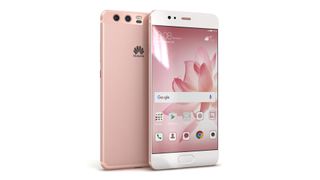
6. Pink phones: cool once more
Year: 2015
Apple made pink phones cool. In 2015 it came up with the Rose Gold iPhone 6S, and phone colours haven’t quite been the same since. Before it, your average pink phone would be near-neon and designed for pre-teens.
Rose gold phones are for, well, pretty much everyone.
Loads of phone makers have followed Apple’s lead. The Galaxy S8, Xperia XZ Premium and Huawei P10 are just three of the most recent examples.
The trend may be on the way out, though. Lime green next, anyone?

7. Voice control
Year: 2011
There were digital assistants long before Siri. They’ve been around since the 80s, and who doesn’t remember the fictional HAL 9000 from 2001: A Space Odyssey?
However there’s a solid argument it’s Siri that nudged Google from using a mostly text-based digital assistant to one that, nowadays, is about as voice driven as Siri.
How? As with so many things, Apple turned something weird and nerdy into something normal. We may not talk to Siri every day, but plenty of people know do. It even inspired 2013’s surprisingly great Siri-a-like love story Her and was arguably the blueprint for Amazon Alexa, which alongside Google Home is on track to become the way we control all our smart home gear.
Hate the smart home future as much as you like, but it’s coming.
8. Flat design: style as substance
Year: 2007
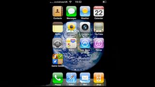
Until version 5.0, Android’s approach to design was completely different from Apple’s. It was the nerd’s choice, openly favoring function over aesthetics. It’s part of what made Android the nerd OS of choice.
Material UI, the new look for Android that came with 5.0 Lollipop, changed all that. It was as if a switch flicked at Google HQ and the team realized style can be a sort of substance. Material design doesn’t look like iOS, but the principles it subscribes to are much closer to those of iOS.
Keep it simple, keep it flat and make sure it looks good: you can imagine that written on the walls in Google HQ circa 2014-2015.
9. All metal and glass design
Year: 2010
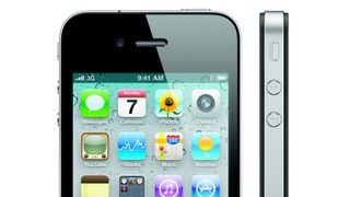
The iPhone established the sort of build quality we now expect from top-end phones. Since 2010, all iPhones have been made almost entirely of metal and glass.
In 2010, Samsung phones were largely made of plastic, as were Sony phones. At that point “Sony” phones were still Sony Ericsson phones too.
HTC had some tasty designs back then, but it wasn’t until 2013 with the HTC One that it got close to Apple-level design. It took Samsung even longer. Looking back, even 2014’s Samsung Galaxy S5 has the sort of design that would seem faintly embarrassing today.
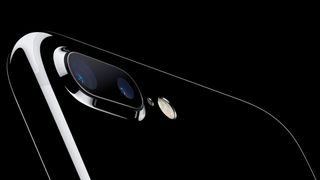
10. 'Lossless' camera zoom
Year: 2016
The iPhone 7 Plus’s coolest new feature was a second rear camera with a “2x zoom” lens. You get zooming without touching dreaded digital zoom, which always kills image quality.
Typical of Apple’s signature tastefulness, it’s much more useful than the LG G6’s wide angle secondary camera or the not-all-that effective dynamic range boosting dual cameras of Huawei phones.
The real proof of success is when someone starts nicking your idea, of course. First the OnePlus 5 adopted a “2x” second camera, then the Samsung Galaxy Note 8. 2018 is likely to bring a lot more copycats too.
A few much older phones deserve some credit for this idea, though. The Nokia PureView cameras used in the Lumia 808 and 1020 had high-quality oversized 41-megapixel sensors that could offer high-quality 4x digital zoom. These cameras would even stack up pretty well today.
Even older phones had true optical zooms too. The earliest were Sharp models that never made it to the US or UK but a year before the iPhone arrived, Nokia’s N93 had a true 3x optical zoom for its 3.15-megapixel camera, using the “barrel” of the screen hinge to fit in the optics. Clever stuff.
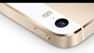
11. Flattering flashes
Year: 2013
These days about 70 per cent of photos seems to be taken with a phone’s front camera. The world is selfie mad.
However, back in 2013 Apple created a minor tech masterpiece that made taking good low-light portraits with the rear camera much, much easier. It was originally dubbed the True Tone flash, a name some of us have forgotten because Apple went on to re-use this term to talk about iPad screens in 2016.
The True Tone flash uses both cold and warm-looking LEDs in the camera flash so that when you take a portrait, skin tones don’t end up washed-out. You’ll find similar two-tone flashes in numerous Huawei phones including the P10 and the new Moto G5S Plus.

12. The death of the headphone jack
Year: 2016
One of the most recent phone features is actually the lack of one. The iPhone 7 and 7 Plus got rid of the earphone jack. We shed a tear over that one to this day.
What’s the excuse? The only believable one is that Apple wanted to sell a boatload of AirPods, its $170/£160 wireless earphones.
And, unfortunately, it’s catching. HTC left it out of the U Ultra, and there are rumors the next Pixel won’t have one either.
Apple leaving out the 3.5mm socket made this move 'socially acceptable' and no doubt had everyone else re-evaluating the need for the port, but it wasn’t actually the first phone to do so. Sony got there first with the Moto Z, but if you really want to split hairs it was dropped on the Alcatel Idol Alpha back in 2014.

Andrew is a freelance journalist and has been writing and editing for some of the UK's top tech and lifestyle publications including TrustedReviews, Stuff, T3, TechRadar, Lifehacker and others.