Microsoft: 'It's the complete vision for Windows 8'
Gabriel Aul on the Windows 8 Consumer Preview

The Windows 8 Developer Preview (as the name suggests) was for introducing developers to Windows 8 and it didn't have many of the pieces of the OS, especially not the final user interface.
The Windows 8 Consumer Preview obviously isn't completely finished, but it is what director of Windows program management Gabriel Aul calls "the complete vision for the product".
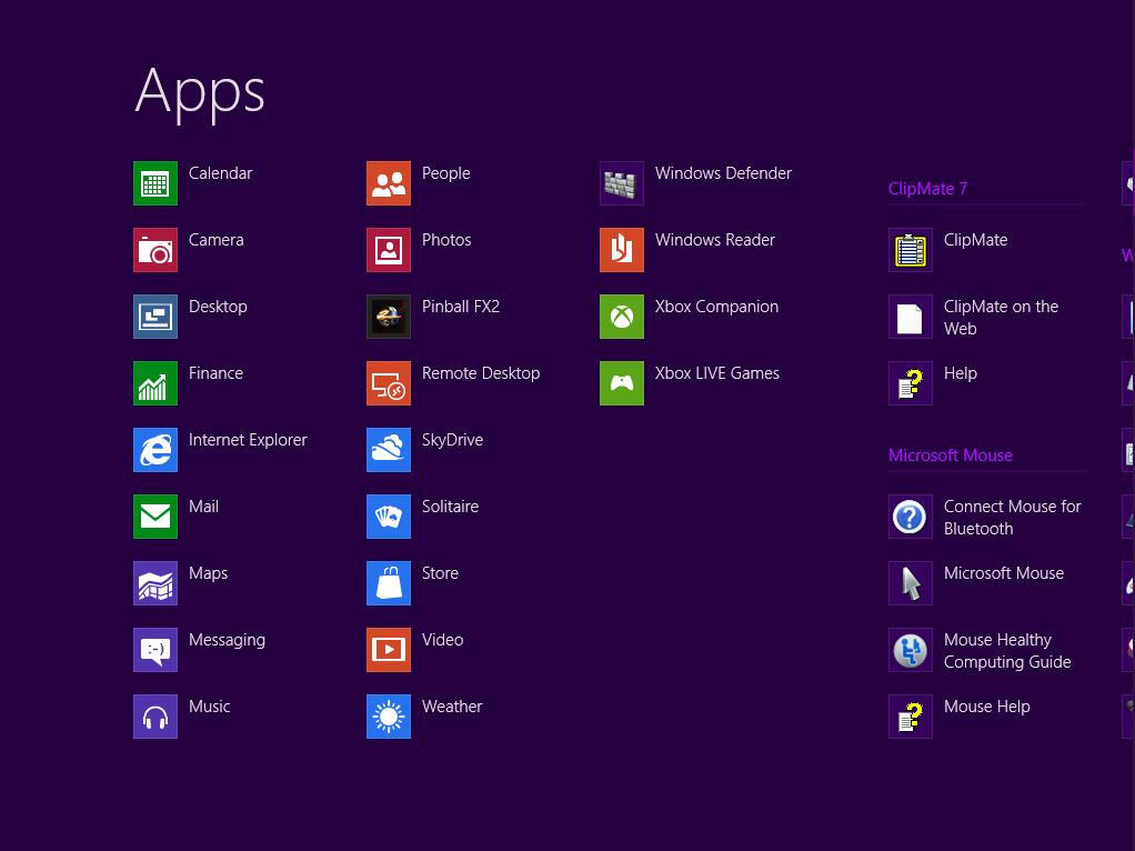
He calls the look of the Metro start screen "more finished and more polished than it was at Build."
In fact, there have been over 100,000 code changes since the Developer Preview, which makes the Consumer Preview a wholly different beast.
And while there are new ways of switching between applications and new touch controls "we also went back and added a ton of mouse and keyboard support to complete that experience," Aul promises.
The touch controls are a more developed version of what we saw at CES this year. Aul explains the logic behind the way they work: "The new things are all about the edges. The left and right edges are about Windows controls; the left side is about switching, the right side is about controls.

The top and the bottom edge are about app controls, and they both do the same so you can choose which you prefer."
Get the best Black Friday deals direct to your inbox, plus news, reviews, and more.
Sign up to be the first to know about unmissable Black Friday deals on top tech, plus get all your favorite TechRadar content.
That makes sense for touch; "when you're holding [a tablet] the touch is all about the edges. Ergonomically, they're the easiest thing to hit with my thumbs."
The Windows 8 Start Screen
The charms are carefully arranged, he says. "The Start screen [charm] is always right there under my thumb." But it's also optimised for mouse users, who can just roll into the corner area without having to be too precise.
"With a mouse, if I have to pick a particular pixel it needs fine control, but for the Metro controls you can just jam the pointer up into the corners – you don't have to be precise. When I pull down a charm, I'm putting my mouse in the right place for the controls. I make a big movement to open the charms, I pull down and my mouse is there, I hit Settings and my mouse is right where the controls are, so it's a very small movement."
Moving between Windows 8 Metro apps
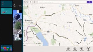
Putting the mouse in the top left corner shows a thumbnail of the next Metro app, but you can pull down to see thumbnails for up to five current apps. Outlines of the thumbnail edges help make that more obvious.
"It has hints that there are tiles hidden away when I put the mouse in the corner; it's very subtle, it's just something to say there's something here." With a touchscreen, swiping an app in from the left and back off screen shows the same thumbnail strip, or you can use Windows+Tab on the keyboard.
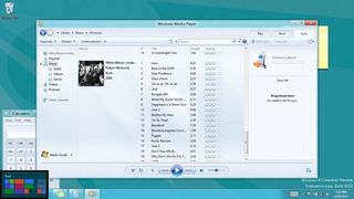
Need to see more than five apps (or to be able to jump straight to individual apps on the desktop)? Alt+Tab gives you thumbnails for all running apps the way you're used to.
The Start Menu still exists in Windows 8
And while the Start button is no longer an orb at the end of the taskbar, clicking in the corner still works (and hovering your mouse there shows a thumbnail of the Start menu you can click).
"We didn't take the Start menu away," he points out; "it's just zero pixels. In the lower left corner you have Start where you expect it to be, you click it to jump back to Start. Or if I go to the lower corner and push up, I get that same switching list."

Touch is also more responsive in the Consumer Preview, Aul claims. "We've got the physics of swipe dialled in now; as you swipe it really sticks to your finger. Switching performance is as fast as I can flick through. The Windows key takes me to Start or whatever I'm doing as fast as I can do it."
Scrolling through the start screen with a mouse now works directly; instead of grabbing a scroll bar you just move your mouse to the side of the screen. That gives you a more responsive scrolling behaviour, especially if you have a scroll wheel on your mouse.
"It has a physicality to it, there's a different response when I push a little or a lot."
And while the picture password option is certainly easier than tapping out a password on a tablet screen, Aul claims it can be more secure. "It's cryptographically stronger than a numeric PIN, and it's actually as good as a strong password if you have a complex photo."
Windows 8 on different devices
Aul is a big fan of Windows tablets such as the Samsung Series 7 that Microsoft has frequently used to demo Windows 8 (check out our Hands on: Windows 8 tablet review) but he also dropped strong hints about how Windows on ARM (WOA) tablets will fit in as companion devices that rely on syncing documents and settings.
"I love the tablet. Other people may want smaller, more power-efficient tablets and another computer. If I'm on the couch browsing and reading email and I want to go to work I dock it and work [on the same machine]. In the tablet scenario, I put it down, I walk over to my desktop and log in and it'll feel just like the machine I've been using. The IE history is even there. I don't have to connect it and sync stuff; it just all happens automatically."
The Windows 8 Consumer Preview download is available from Microsoft now. To get it, head over to http://preview.windows.com.
Mary (Twitter, Google+, website) started her career at Future Publishing, saw the AOL meltdown first hand the first time around when she ran the AOL UK computing channel, and she's been a freelance tech writer for over a decade. She's used every version of Windows and Office released, and every smartphone too, but she's still looking for the perfect tablet. Yes, she really does have USB earrings.
Most Popular


